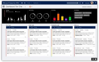
The interactive service hub comes loaded with a multi-stream dashboard that is specifically targeted at Tier 1 agents. Users can view and act on their workload across multiple data streams. These streams can show data from Views or Queues, such as My Activities, My Cases, Cases from Queues I’m a member of, etc. Interactive charts provide visual snapshots of key metrics related to work items, and are also visual filters that enable agents to slice and dice the data. Four layouts are available to build these dashboards.
The interactive service hub also comes pre-loaded with a single-stream dashboard for Tier 2 agents. It has a single data stream in a pane on the left that typically shows an aggregate view of the workload. The stream can show data from Views or Queues, such as All Active Cases. Like the multi-stream dashboards, single-stream dashboards also come with interactive charts that can be used to filter data. The tiles on the right side of the dashboard show a count of records from a View or Queue, and users can get a peek at the records by selecting a tile. As with multi-stream dashboards, there are four layouts to build the single-stream dashboards.


